Using Radio Mobile for Windows
Creating RF Coverage Plots
Previous: Creating Antenna Patterns Next: Point-To-Point Link
With Radio Mobile properly configured you can now begin using it to plot coverage maps. Plotting coverage is an easy task and only takes a few minutes.
Click on File and select Map Properties. Enter -84.48822 for the longitude and
45.62303 for latitude. Under size (pixel) enter 1000 for both height
and width. Enter 15 under size (km) in the height field (see Figure
24.). Make sure you have at least one elevation data source selected
and click on extract. This will generate a map that looks similar to Figure 25.
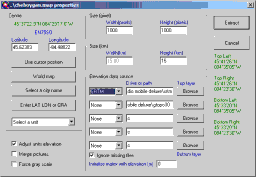
Figure 24: Example Map Properties
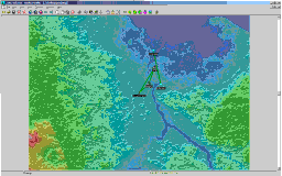
Figure 25: Example Map for RF Coverage Plot
Click on Edit and select Unit Properties from
the menu (the last option.) to display the Unit Properties window.
Click on the "Enter LAT LON or QRA" button and enter 84° 29'
17.6" W for longitude and 45° 37' 22.9" N for latitude then
click on apply. Highlight "Unit 01" in the Name field and change this
to Access Point. Repeat these steps for the following units:
Longitude
Latitude
Name
84° 29' 37.4"
W
45° 38' 16.7"
N
CPE
84° 27' 5.3"
W
45° 43' 36.4"
N
Bridge1
84° 28' 47.2"
W
45° 37' 43.2"
N
Bridge2
Example Units for Tutorial
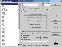
Figure 26: Unit Properties
Now that you have a few units added to your network you can begin creating plots.
To begin click on the Tools menu, select Radio Coverage and then Single Polar
from the menu that pops up. You should see a window that looks like
Figure 27.
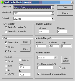
Figure 27: Radio Coverage Window
Make sure
the center unit selected is Access Point. Set the Mobile unit to CPE
and the Network should be 802.11b that was created earlier. If nothing
shows up under Centre or Mobile unit make sure you have the correct
network selected. Under the Plot dialog select all three options. Choosing
Rainbow coverage will show you areas of varying signal strength which
can be very useful. Change Threshold to read dBm and change "From"
to -73 and "To" to -43. Check to make sure the omni.ant antenna pattern
file is selected and then click on Apply. Click on yes when asked to
convert the map to greyscale. Depending on how powerful your computer
is you should see a plot similar to Figure 28 in a few seconds.
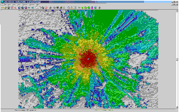
Figure 28: Example Coverage Plot
When the software finishes the plot a window will pop up asking you to keep the coverage plot. Select the second option, Keep in New Image, and click on ok. This will create your coverage map in a new image.
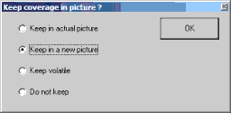
Figure 29: Keep Plot In New Image
Clicking
on View and then show networks will show you where all
of the units within your chosen network fall within the coverage plot.
This can be useful for site surveys. For more detail click on Edit,
select Merge from Mapblast and select the Multiply option. The resulting
map will be a merge of your radio coverage plot and the Mapblast map.
See Figure 30 for the results.
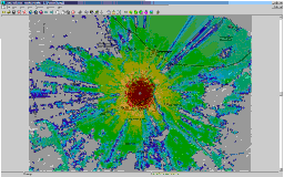
Figure 30: Example Mapblast Merge
I have found
plots like this to be very accurate using the generic antenna patterns
included with Radio Mobile. In the next section, Point-To-Point
Link,
you can learn how to use Radio Mobile to plot point-to-point links
for applications such as connecting buildings or displaying the Fresnel
zone between an Access Point and a CPE.
Previous: Creating Antenna Patterns Next: Point-To-Point Link
Using Radio Mobile for Windows
Creating RF Coverage Plots
Previous: Creating Antenna Patterns Next: Point-To-Point Link
With Radio Mobile properly configured you can now begin using it to plot coverage maps. Plotting coverage is an easy task and only takes a few minutes.
Click on File and select Map Properties. Enter -84.48822 for the longitude and 45.62303 for latitude. Under size (pixel) enter 1000 for both height and width. Enter 15 under size (km) in the height field (see Figure 24.). Make sure you have at least one elevation data source selected and click on extract. This will generate a map that looks similar to Figure 25.
Figure 24: Example Map Properties
Figure 25: Example Map for RF Coverage Plot
Click on Edit and select Unit Properties from the menu (the last option.) to display the Unit Properties window. Click on the "Enter LAT LON or QRA" button and enter 84° 29' 17.6" W for longitude and 45° 37' 22.9" N for latitude then click on apply. Highlight "Unit 01" in the Name field and change this to Access Point. Repeat these steps for the following units:
| Longitude | Latitude | Name |
| 84° 29' 37.4" W | 45° 38' 16.7" N | CPE |
| 84° 27' 5.3" W | 45° 43' 36.4" N | Bridge1 |
| 84° 28' 47.2" W | 45° 37' 43.2" N | Bridge2 |
Example Units for Tutorial
Figure 26: Unit Properties
Now that you have a few units added to your network you can begin creating plots. To begin click on the Tools menu, select Radio Coverage and then Single Polar from the menu that pops up. You should see a window that looks like Figure 27.
Figure 27: Radio Coverage Window
Make sure the center unit selected is Access Point. Set the Mobile unit to CPE and the Network should be 802.11b that was created earlier. If nothing shows up under Centre or Mobile unit make sure you have the correct network selected. Under the Plot dialog select all three options. Choosing Rainbow coverage will show you areas of varying signal strength which can be very useful. Change Threshold to read dBm and change "From" to -73 and "To" to -43. Check to make sure the omni.ant antenna pattern file is selected and then click on Apply. Click on yes when asked to convert the map to greyscale. Depending on how powerful your computer is you should see a plot similar to Figure 28 in a few seconds.
Figure 28: Example Coverage Plot
When the software finishes the plot a window will pop up asking you to keep the coverage plot. Select the second option, Keep in New Image, and click on ok. This will create your coverage map in a new image.
Figure 29: Keep Plot In New Image
Clicking on View and then show networks will show you where all of the units within your chosen network fall within the coverage plot. This can be useful for site surveys. For more detail click on Edit, select Merge from Mapblast and select the Multiply option. The resulting map will be a merge of your radio coverage plot and the Mapblast map. See Figure 30 for the results.
Figure 30: Example Mapblast Merge
I have found plots like this to be very accurate using the generic antenna patterns included with Radio Mobile. In the next section, Point-To-Point Link, you can learn how to use Radio Mobile to plot point-to-point links for applications such as connecting buildings or displaying the Fresnel zone between an Access Point and a CPE.